
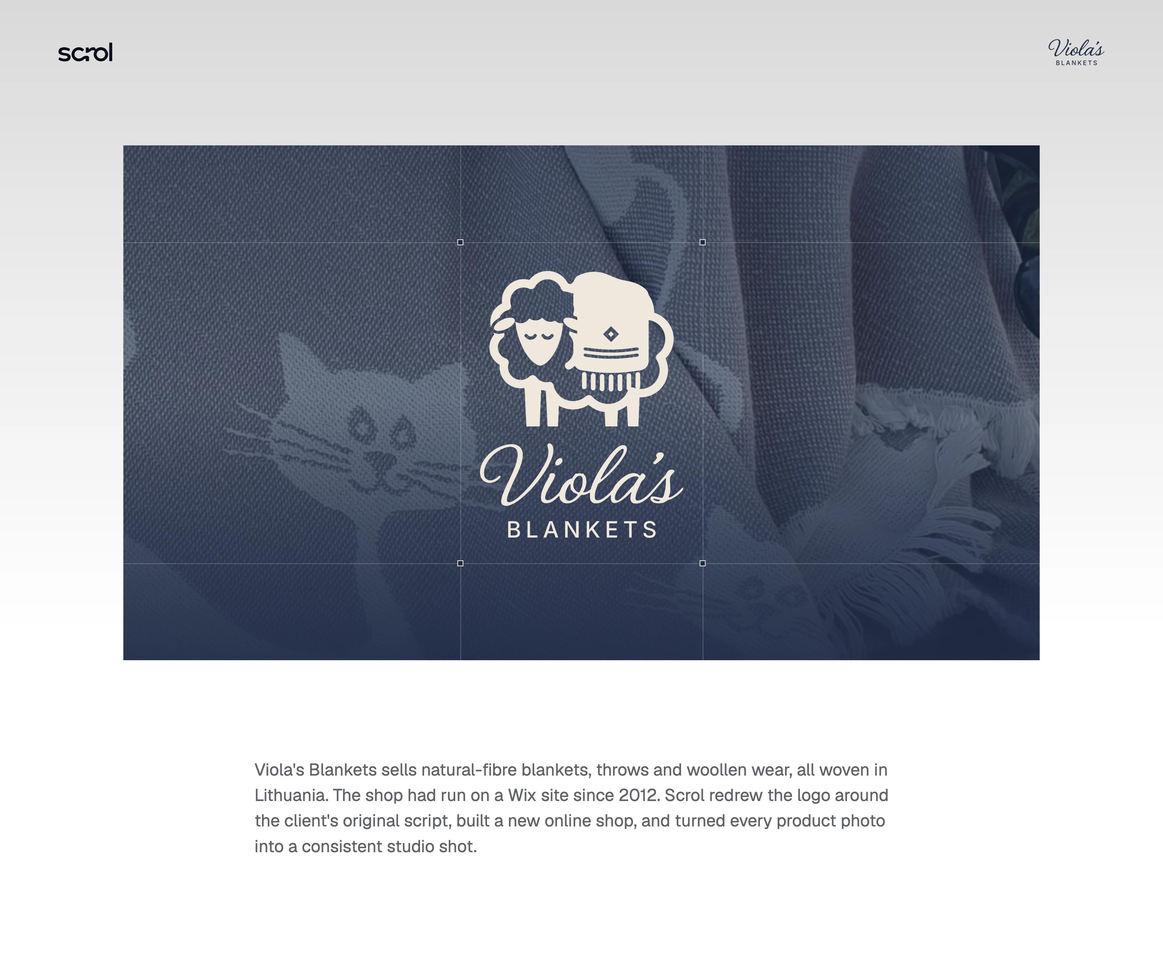
A warmer identity and a clearer online shop for Viola’s Blankets
From a Wix shop dating back to 2012 to a coherent brand and full-width online store. We retained Viola’s familiar script, introduced a sheep mark and brought the entire product range into one consistent visual system.
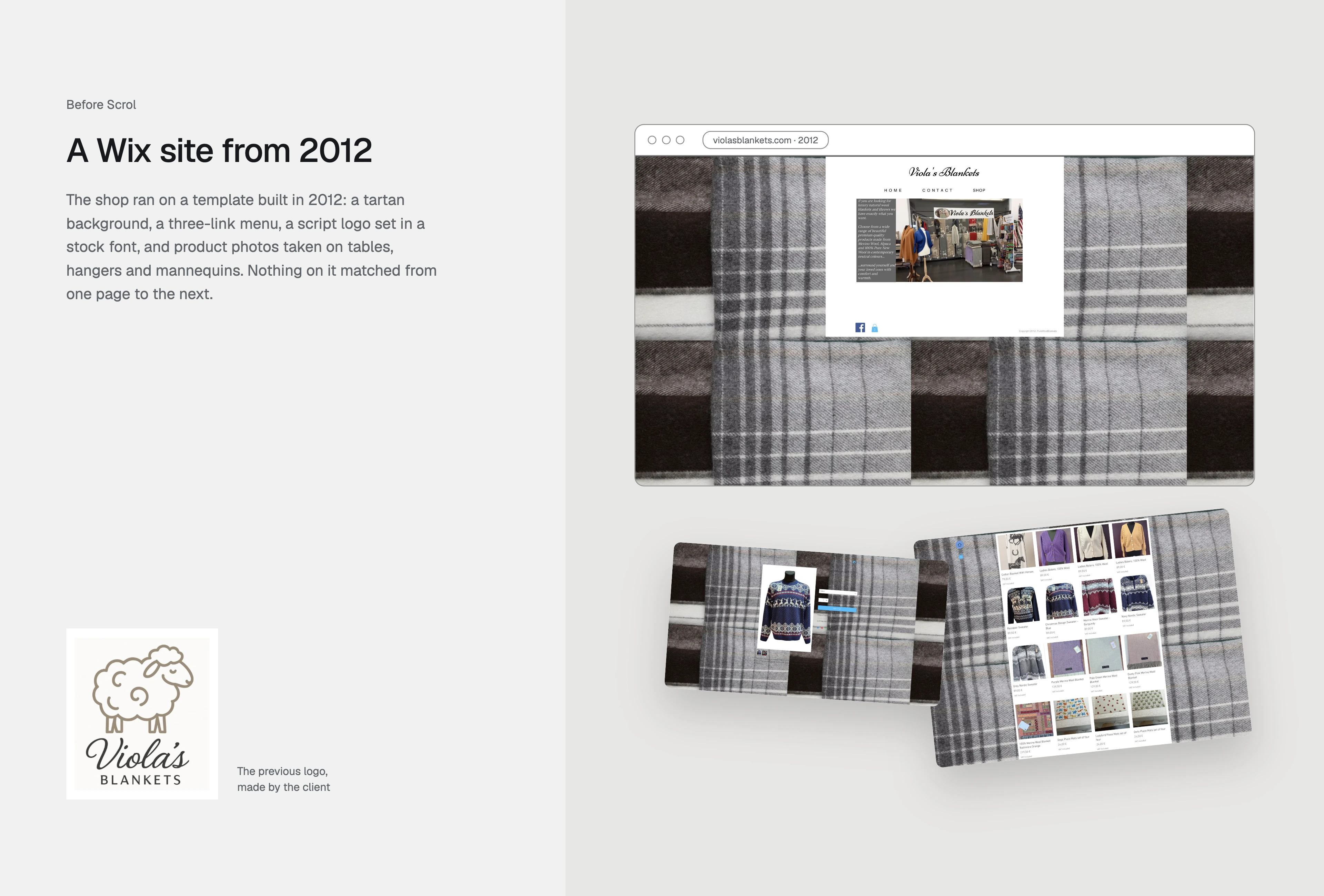
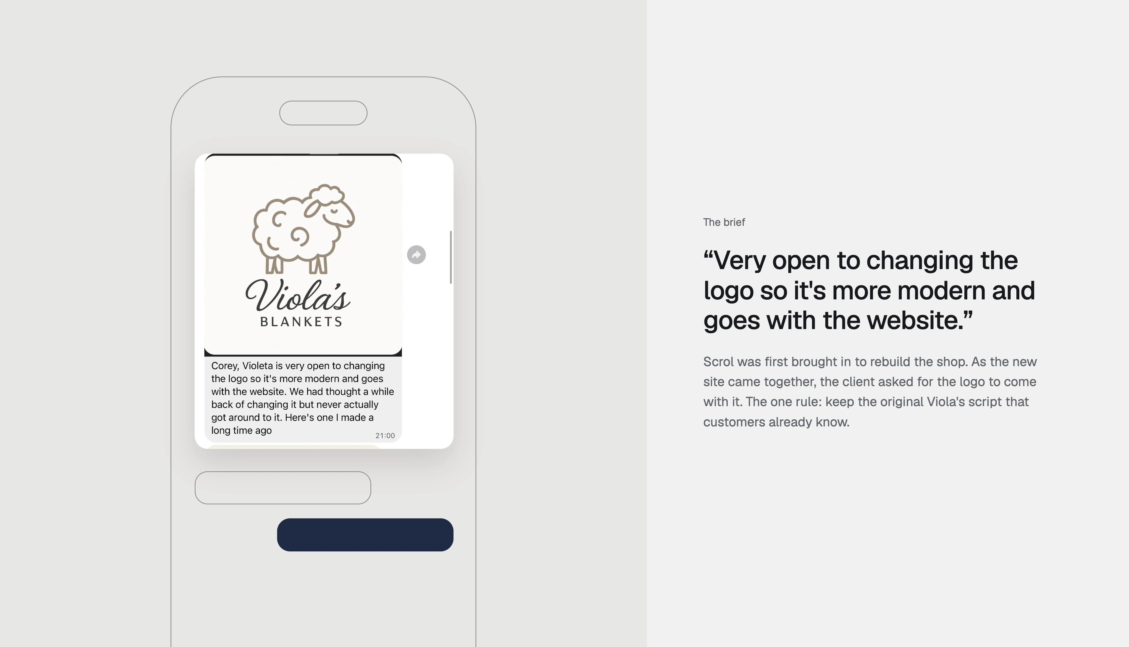
Viola’s Blankets sells natural-fibre blankets, throws and woollen wear woven in Lithuania. Its online shop had been running on a Wix template since 2012. A tartan background, a minimal three-link menu and product photographs taken on tables, hangers and mannequins made the range feel inconsistent. Scrol was initially brought in to rebuild the shop. As the new website developed, the client asked us to modernise the logo too, with one clear requirement: retain the original Viola’s script that existing customers recognised.
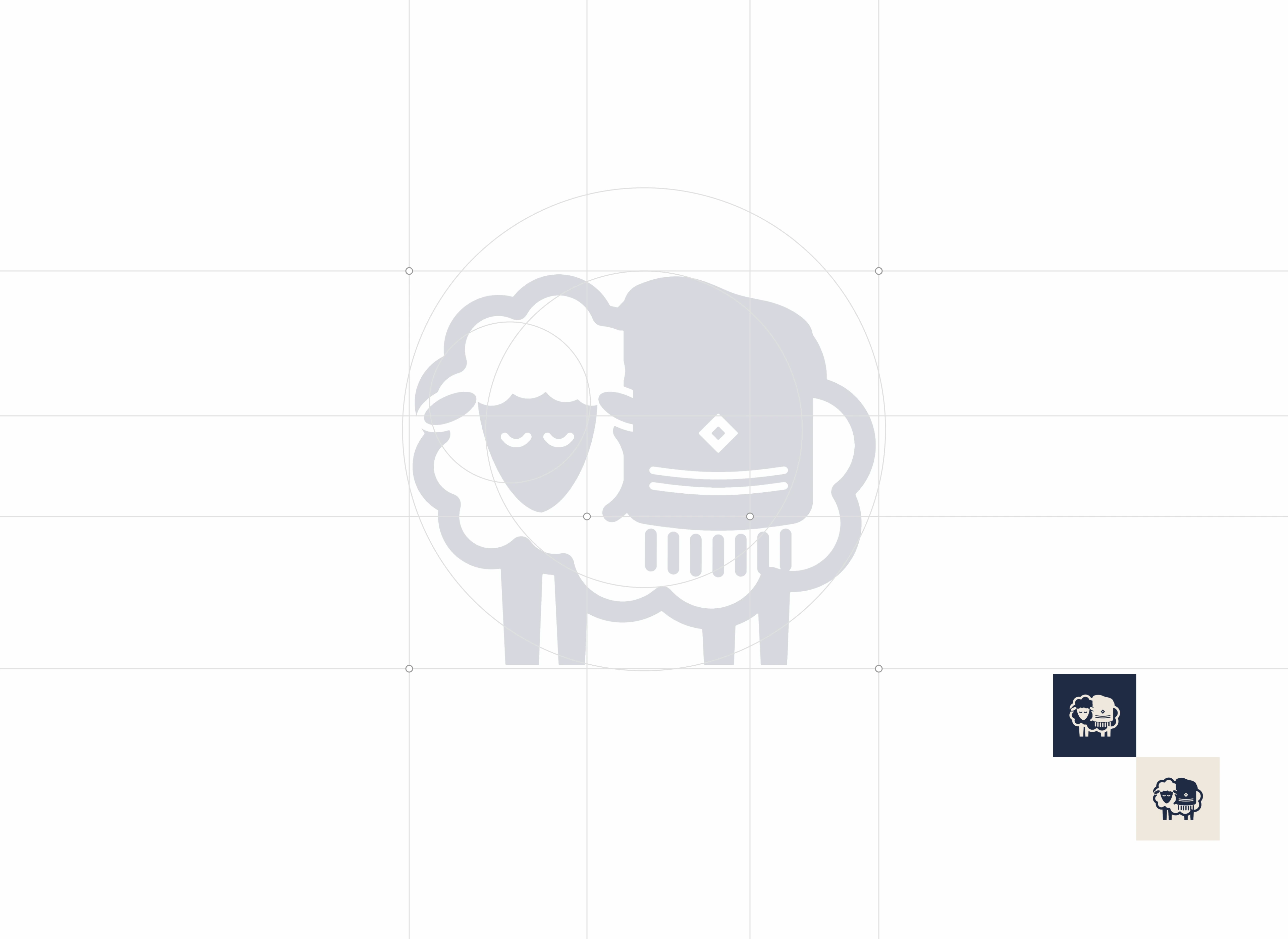
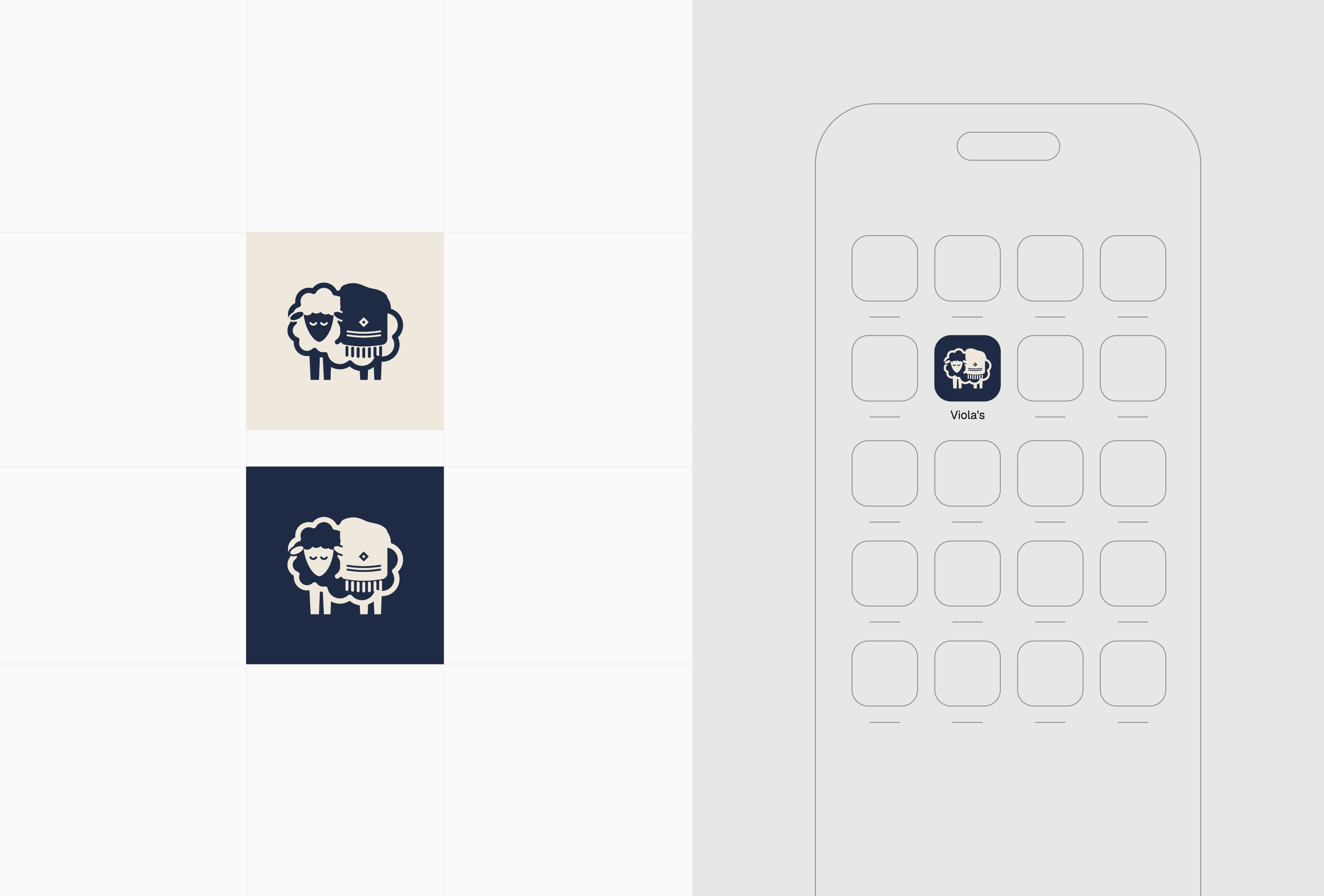
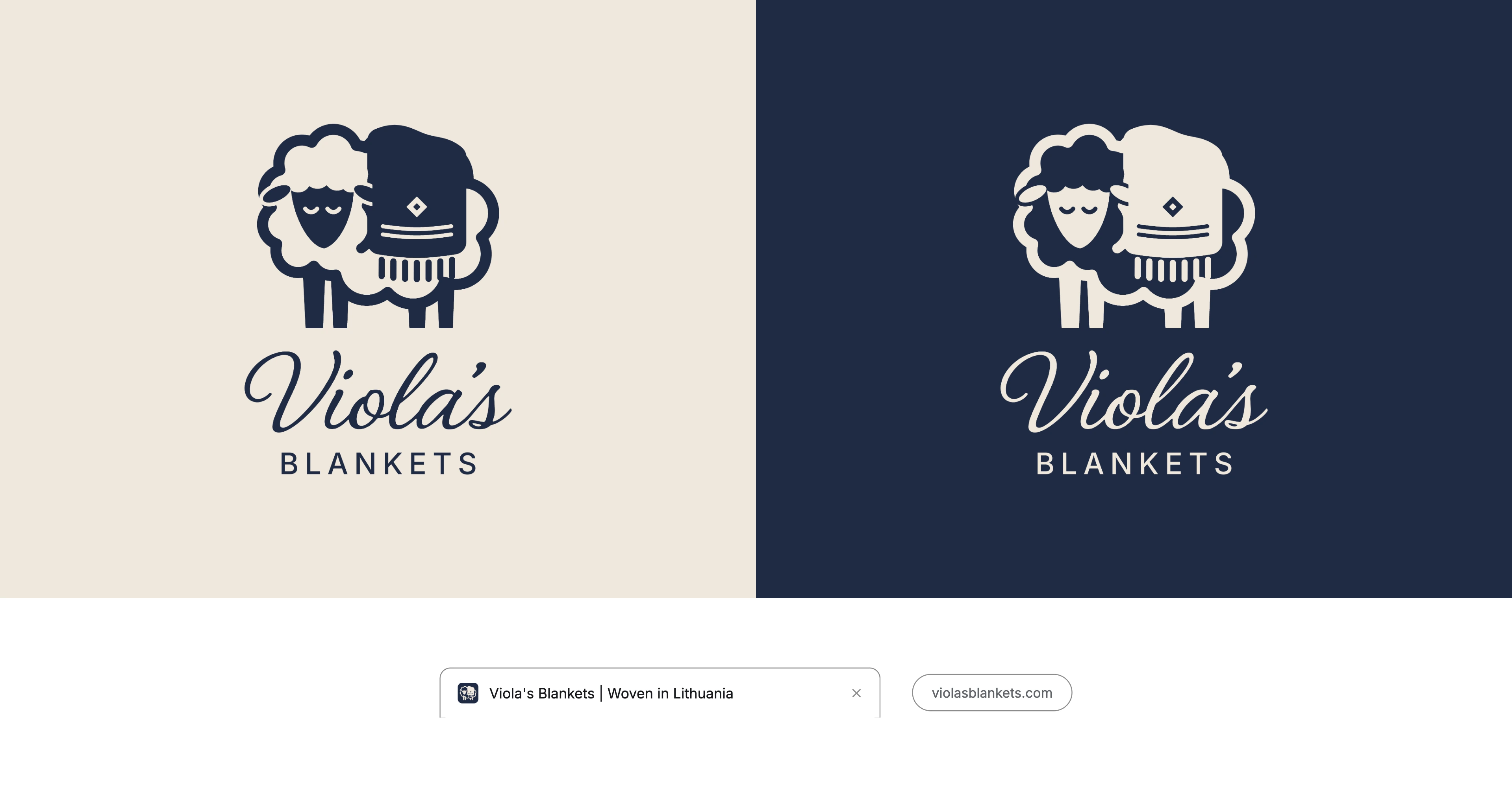
Instead of discarding the brand’s history, we kept the client’s original Viola’s lettering and paired it with a newly drawn sheep mark. The mark construction, standalone icon and small-screen applications were developed as one system, giving the business a recognisable signature at sizes where a full wordmark would be too detailed. Light and dark logo treatments allow the identity to work across product imagery, the shop and browser applications without losing its character.
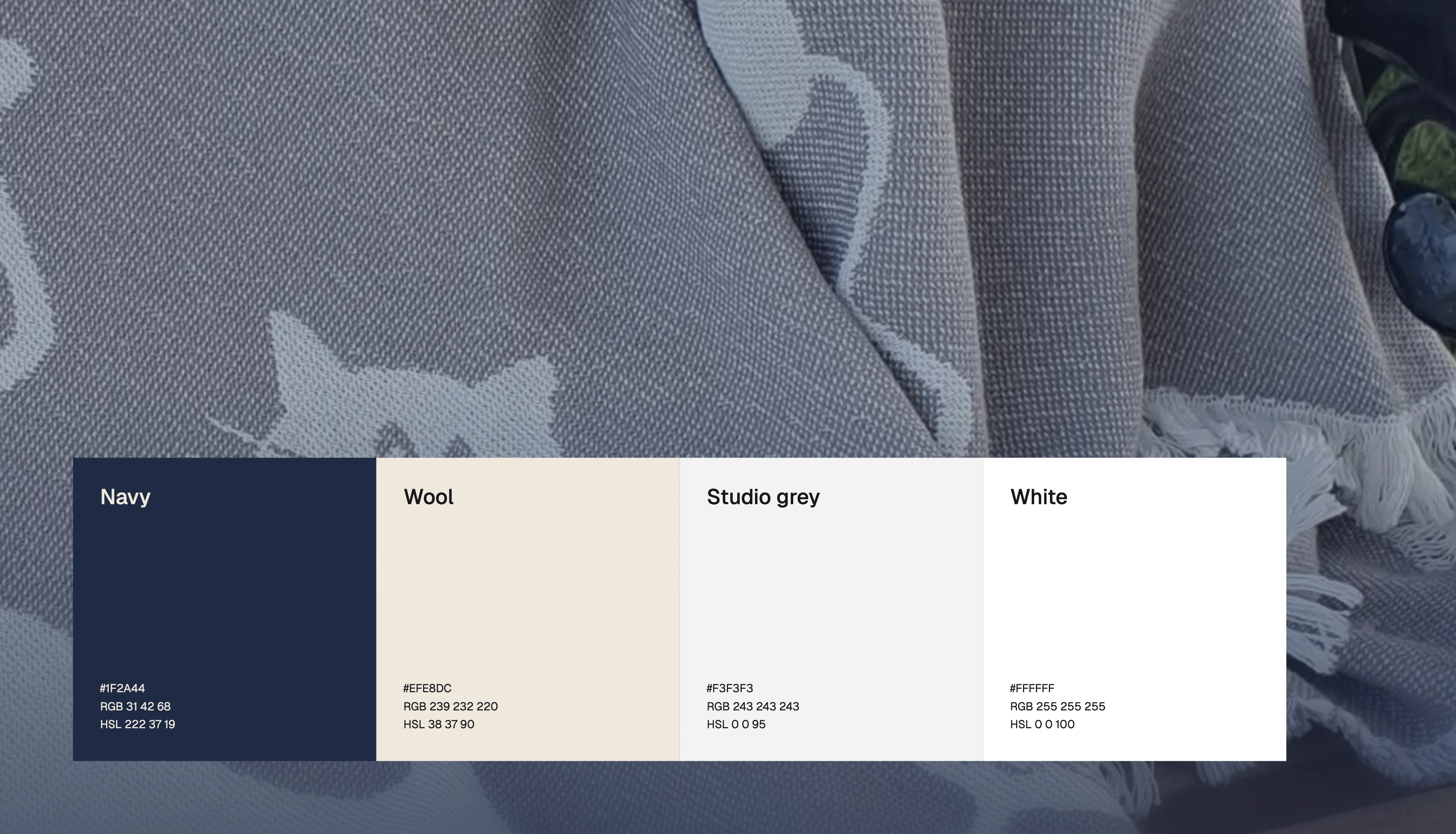
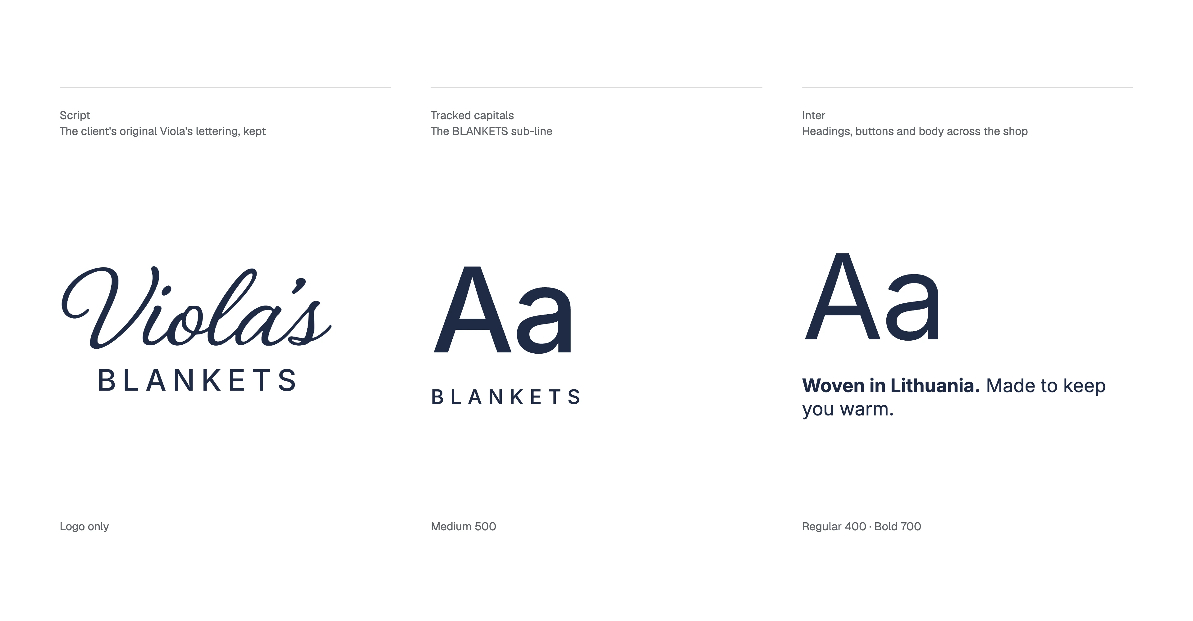
Navy and wool tones anchor the identity, with studio grey and white providing space around the products. The familiar script remains a logo-only element, while tracked capitals define the BLANKETS sub-line. Inter handles the shop’s headings, buttons and body text, giving shoppers a readable interface rather than extending decorative lettering into functional content. Together, these choices connect the warmth of natural textiles with a more consistent digital experience.
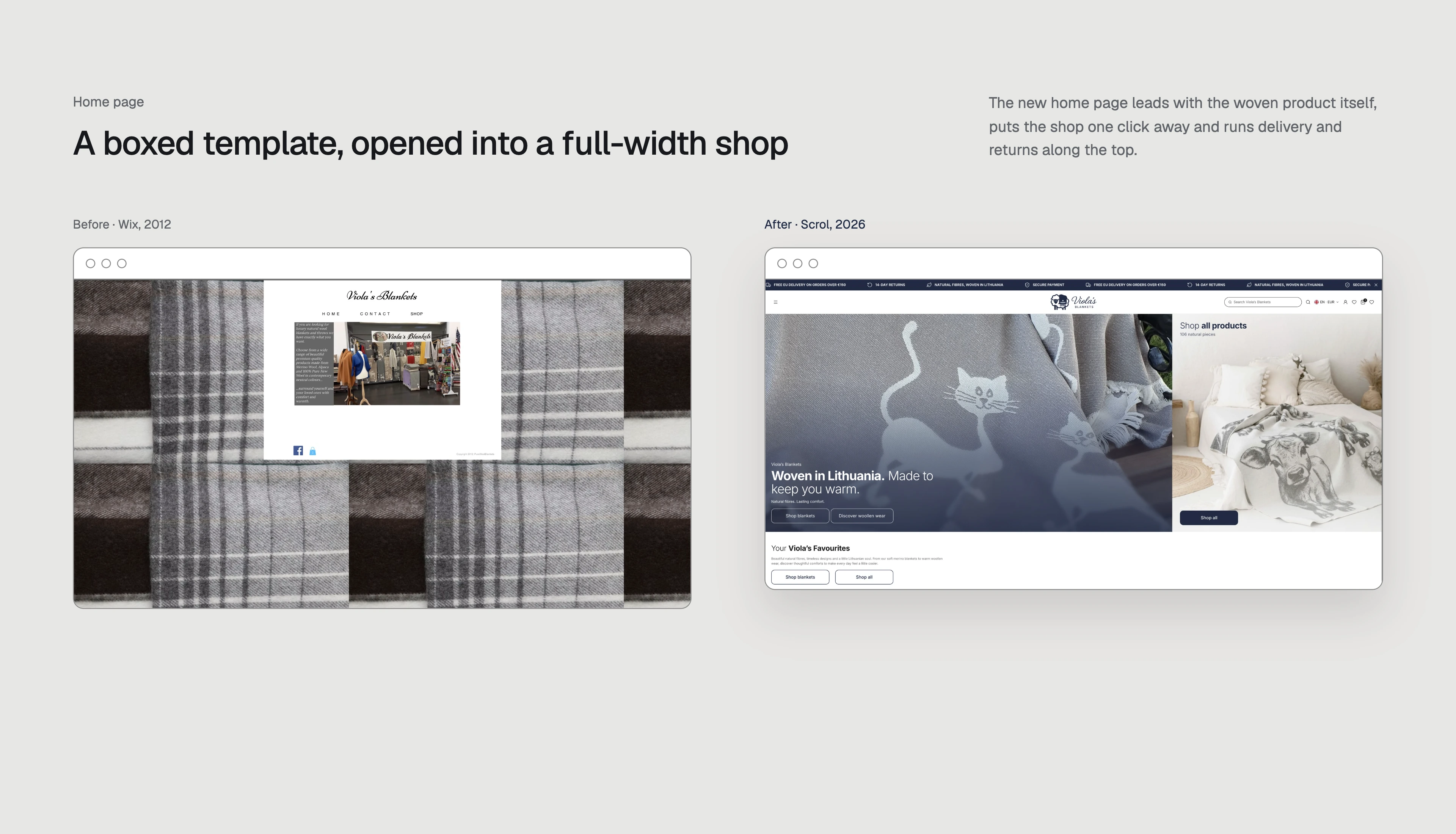
The new homepage leads with the woven products themselves. A full-width presentation replaces the old boxed template, puts the shop one click away and surfaces delivery and returns information along the top. The goal was not simply to make the old site look newer: it was to make the range easier to understand and create a coherent route from the first impression into product browsing.
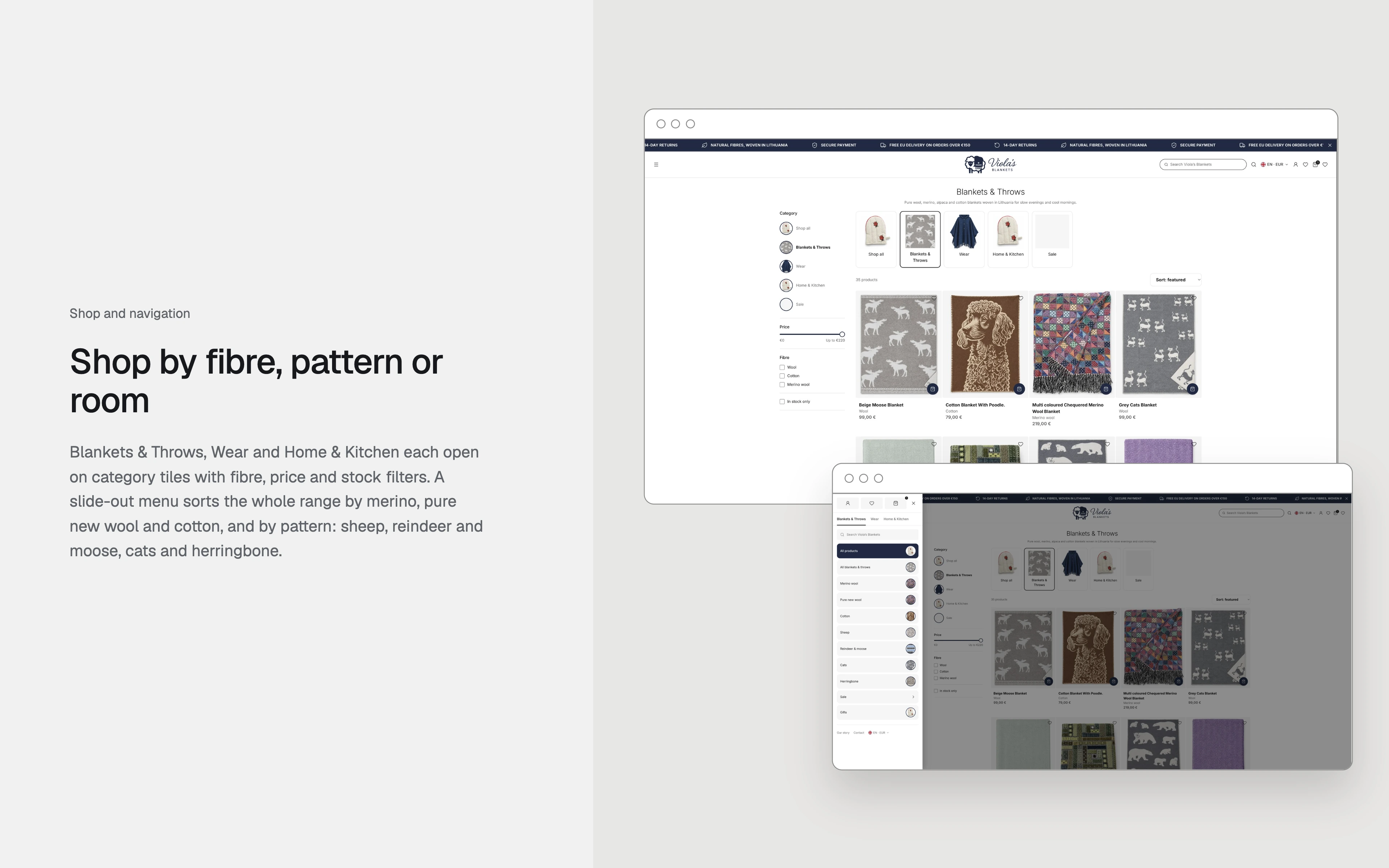
Blankets & Throws, Wear and Home & Kitchen each open onto category tiles. Fibre, price and stock filters help customers narrow the range, while a slide-out menu organises products by merino, pure new wool and cotton. Pattern-led browsing covers sheep, reindeer and moose, cats and herringbone. These entry points let someone shop by material, aesthetic or use, rather than work through an undifferentiated catalogue.
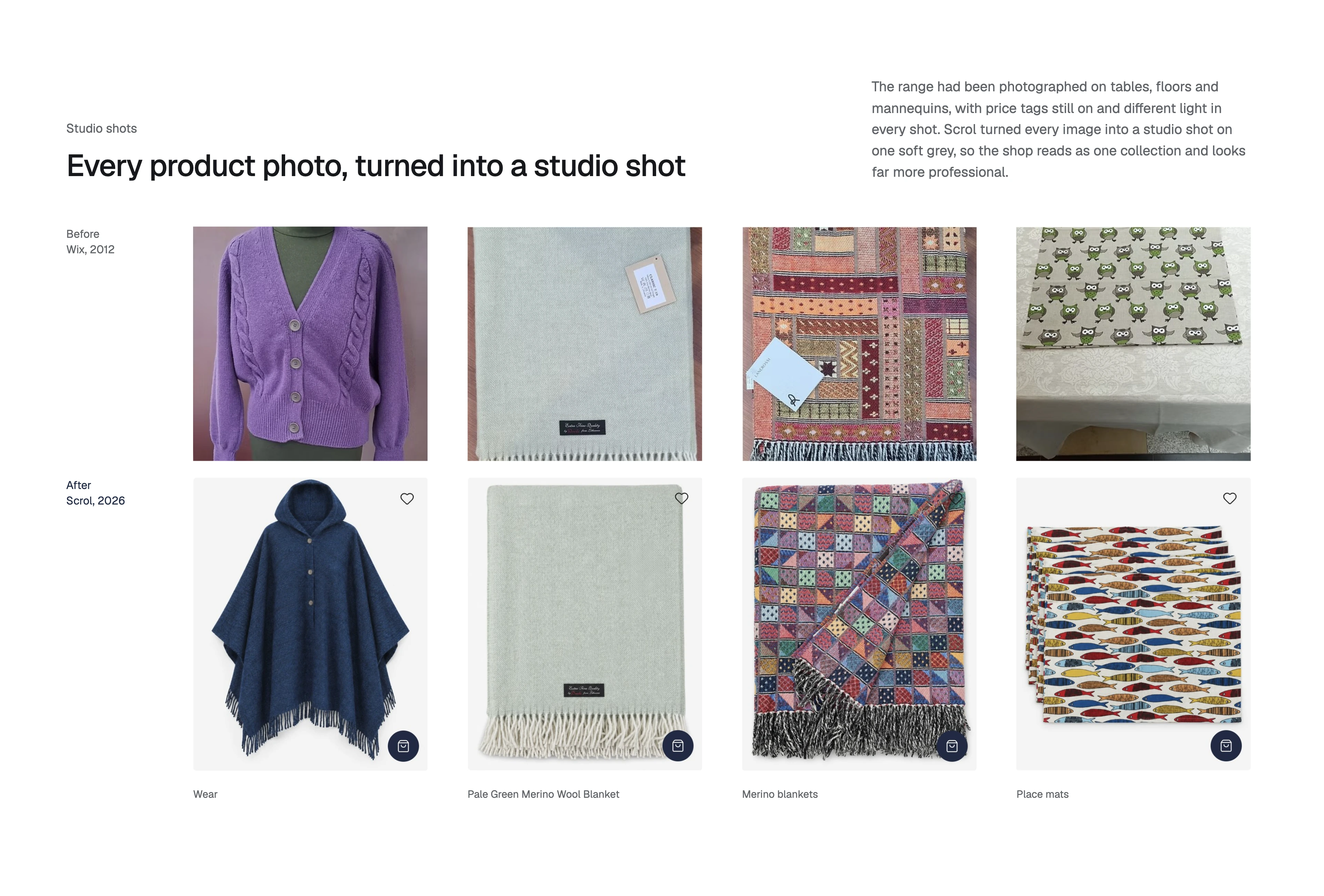
The existing photography varied in background, lighting and presentation, with some products shown on mannequins or with price tags still visible. Scrol transformed every product image into a consistent studio-style shot on a soft grey background. Blankets, woollen wear and smaller home accessories now sit together as one collection. The before-and-after boards show this treatment directly, without relying on invented performance statistics.
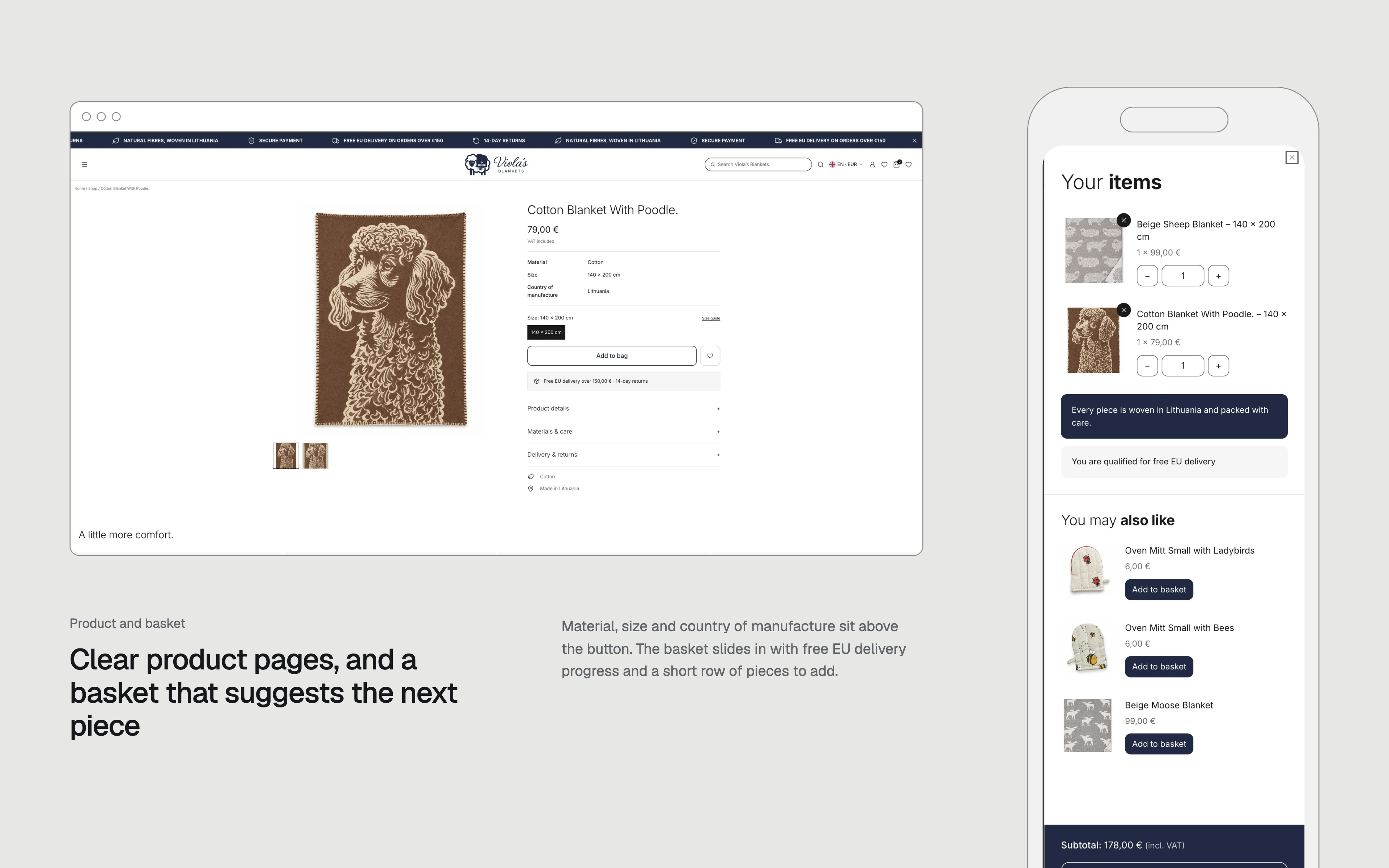
Product pages place material, dimensions and country of manufacture above the purchase button, with supporting sections for care, delivery and returns. A slide-in basket keeps selected items visible, shows progress towards free EU delivery and suggests complementary products. The supplied design shows free EU delivery over €150 and a 14-day returns message; these are the retailer’s displayed terms, not Scrol service offers. The product and basket board demonstrates both the full page and the narrower shopping panel.
Brand design, website development and product-image direction were delivered as one connected piece of work. Keeping the original script preserved familiarity; the new sheep mark and visual system gave it a stronger foundation; and the redesigned store carried that identity into everyday browsing and buying. All thirteen supplied presentation boards are included below, from the original Wix site and client brief through the finished identity, shop, product imagery and basket. No sales uplift or conversion figures have been claimed without supporting data.
Other case studies.
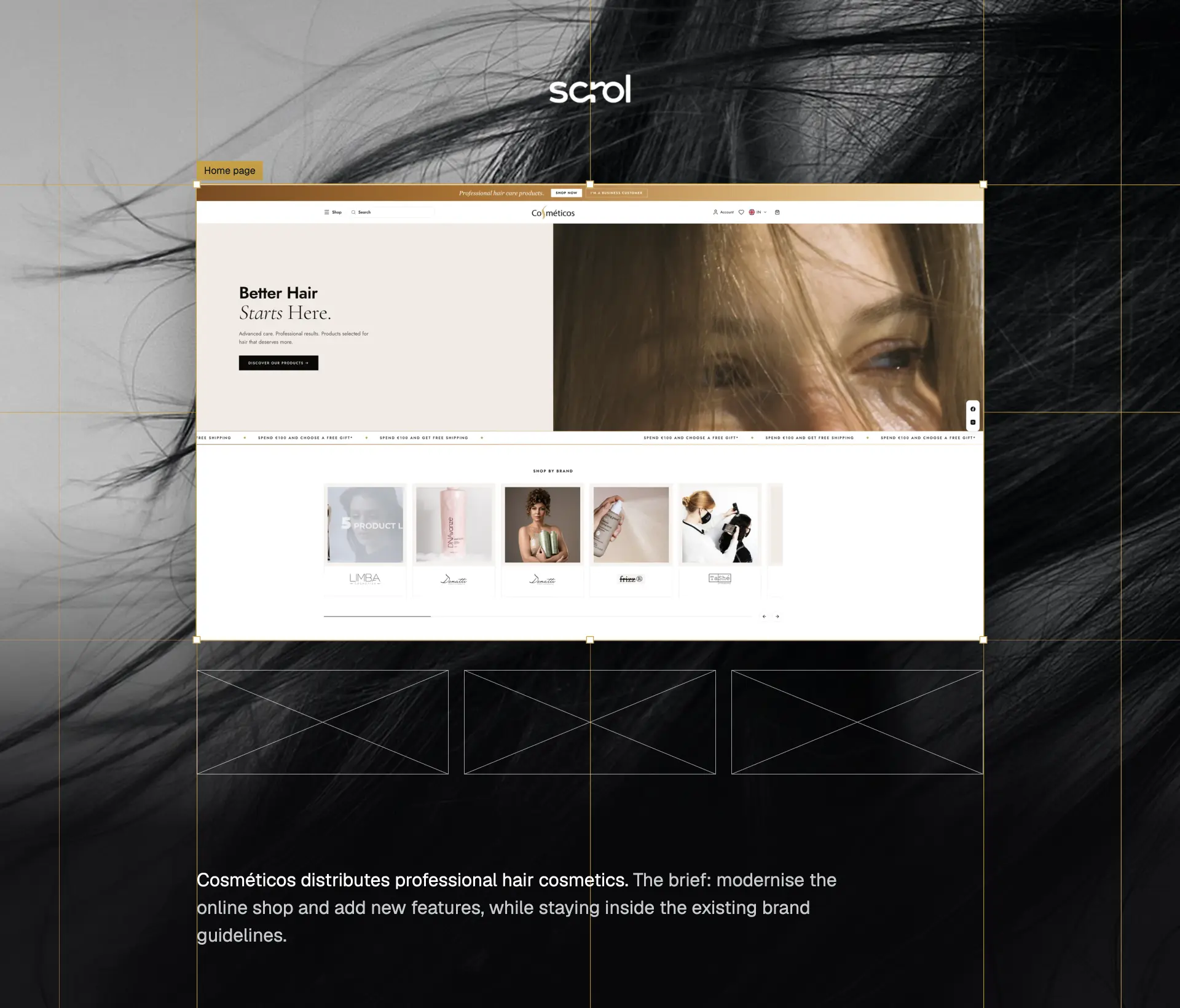
A modern hair-care shopping experience, with a dedicated trade system for business customers.
An activewear identity built around a distinctive H mark, bold typography and Hydro Blue.
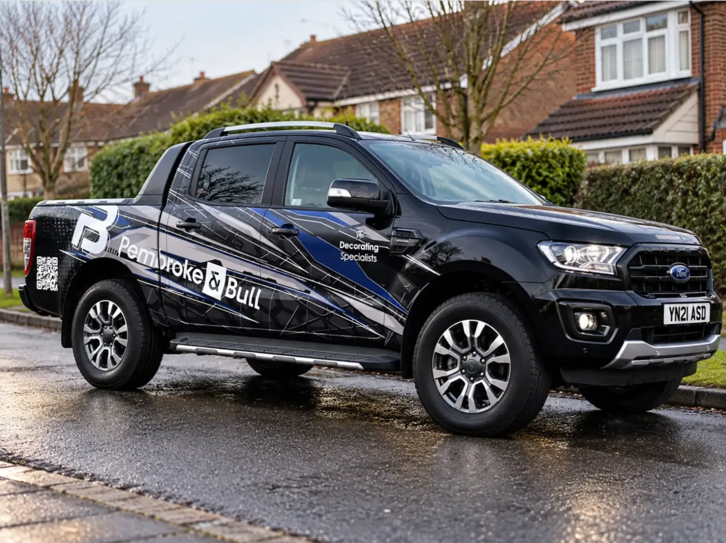
An identity system carried across fleet livery, print, social and site photography.