
Hydra Activewear
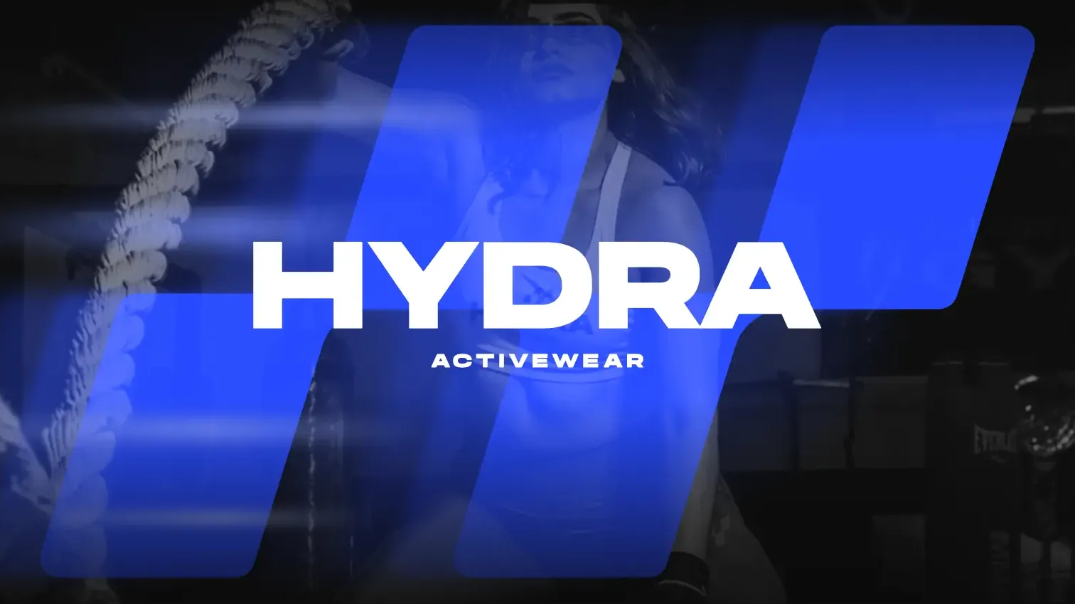
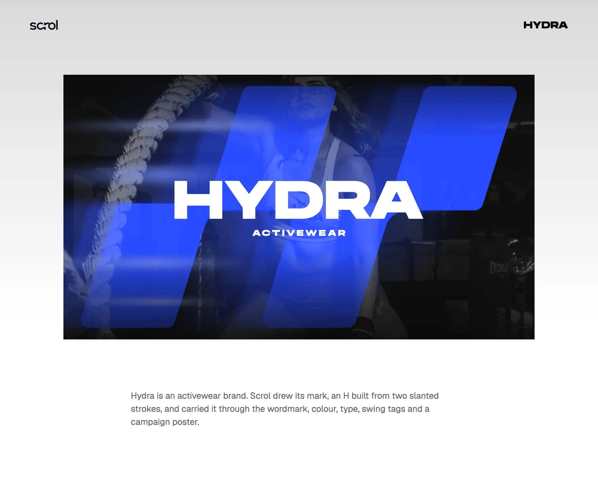
Hydra is an activewear brand. Scrol drew its mark, an H built from two slanted strokes, and carried it through the wordmark, colour, type, swing tags and a campaign poster.
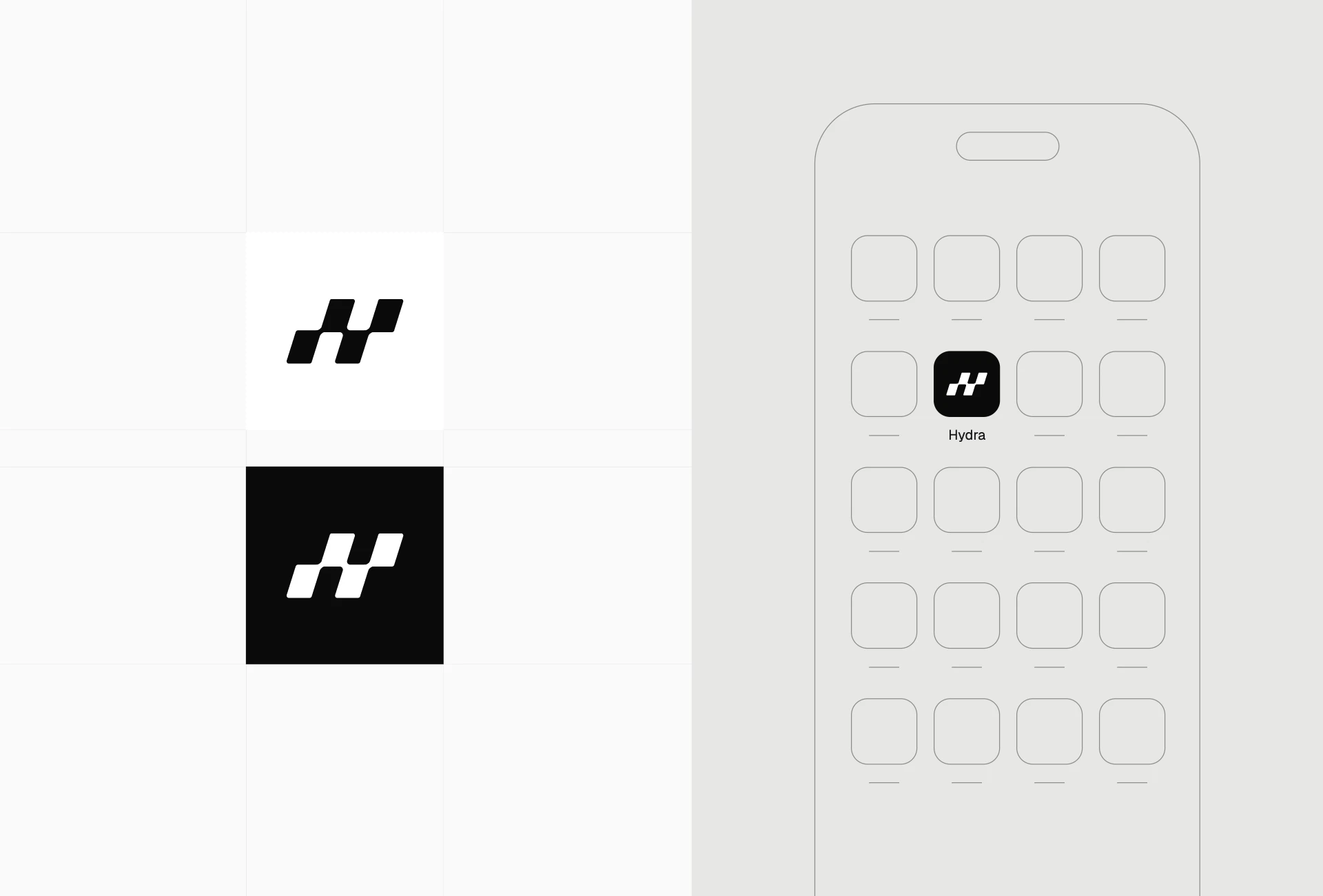
The Hydra mark is an H built from two slanted strokes. The supplied construction board shows its geometry, while black and white versions demonstrate how the same symbol works on contrasting backgrounds and as an app icon.
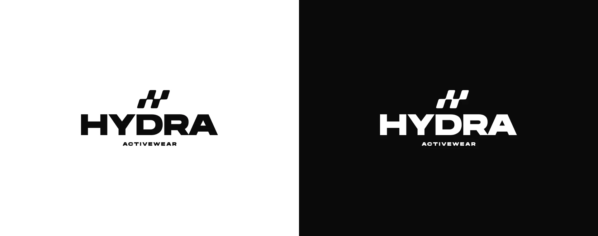
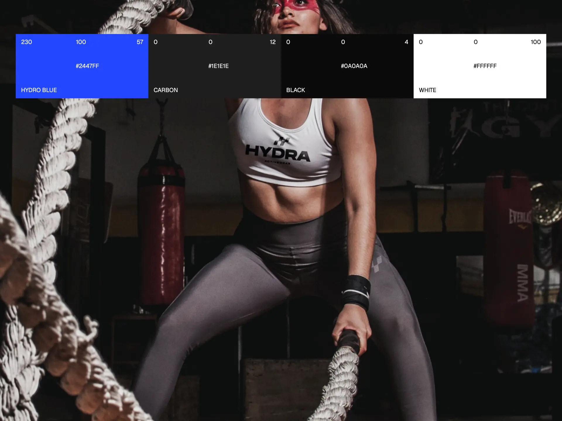
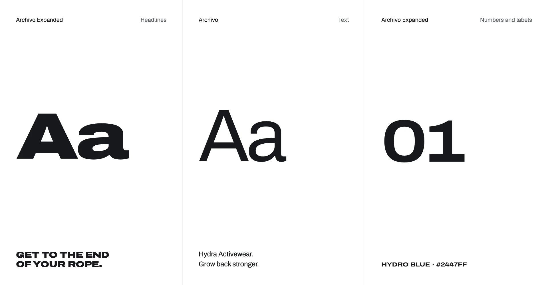
The wordmark pairs a bold HYDRA name with an ACTIVEWEAR descriptor. Hydro Blue sits alongside Carbon, Black and White. Archivo Expanded is used for headlines, numbers and labels, with Archivo for supporting text.
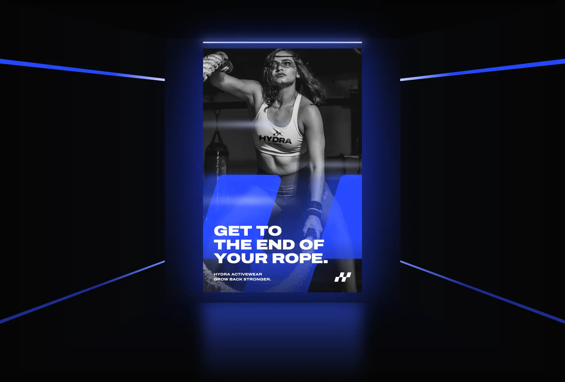
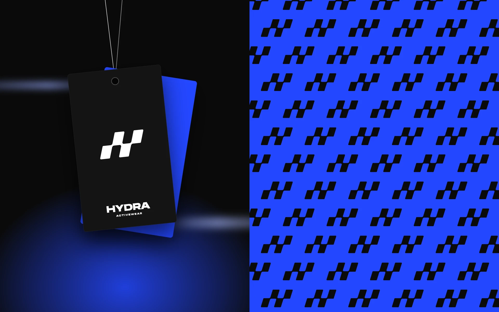
The identity extends into an app-icon concept, a campaign poster, swing tags and a repeating pattern. The poster pairs the brand mark and blue graphic forms with the line “Get to the end of your rope.” and the supporting message “Hydra Activewear. Grow back stronger.”

Other case studies.
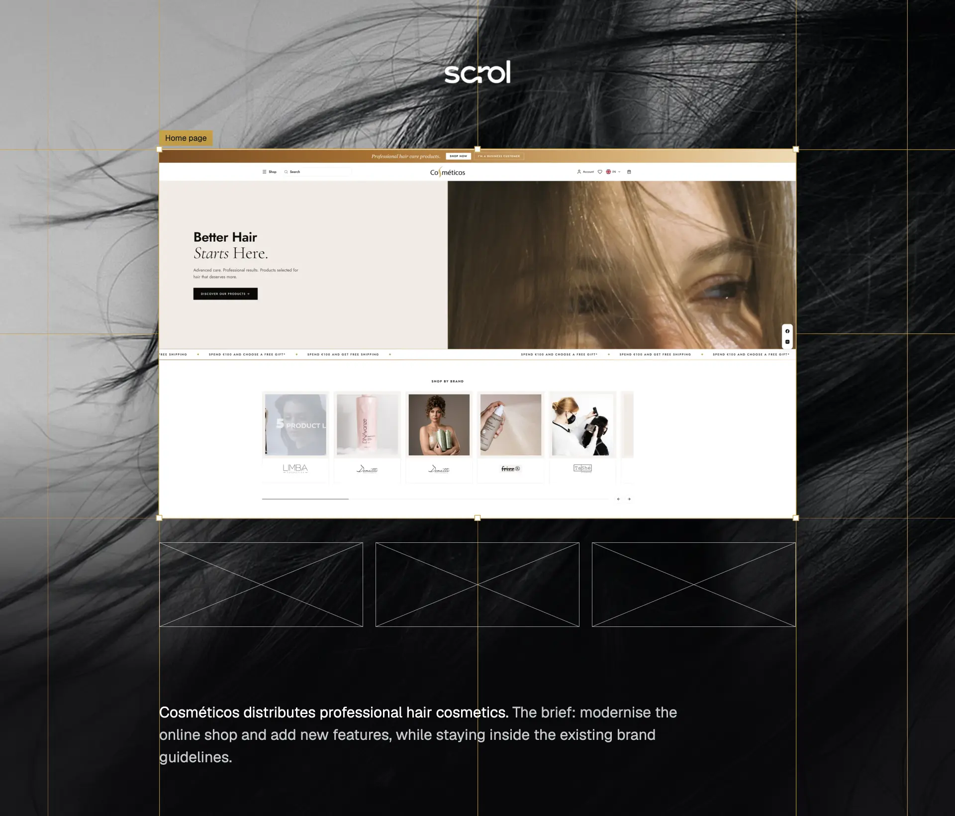
A modern hair-care shopping experience, with a dedicated trade system for business customers.
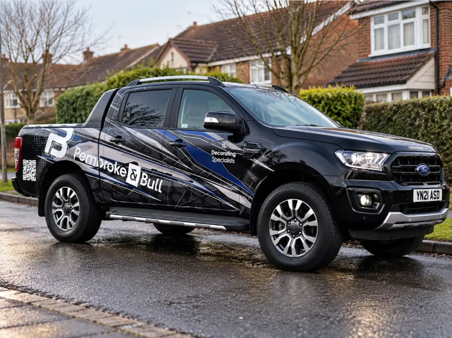
An identity system carried across fleet livery, print, social and site photography.
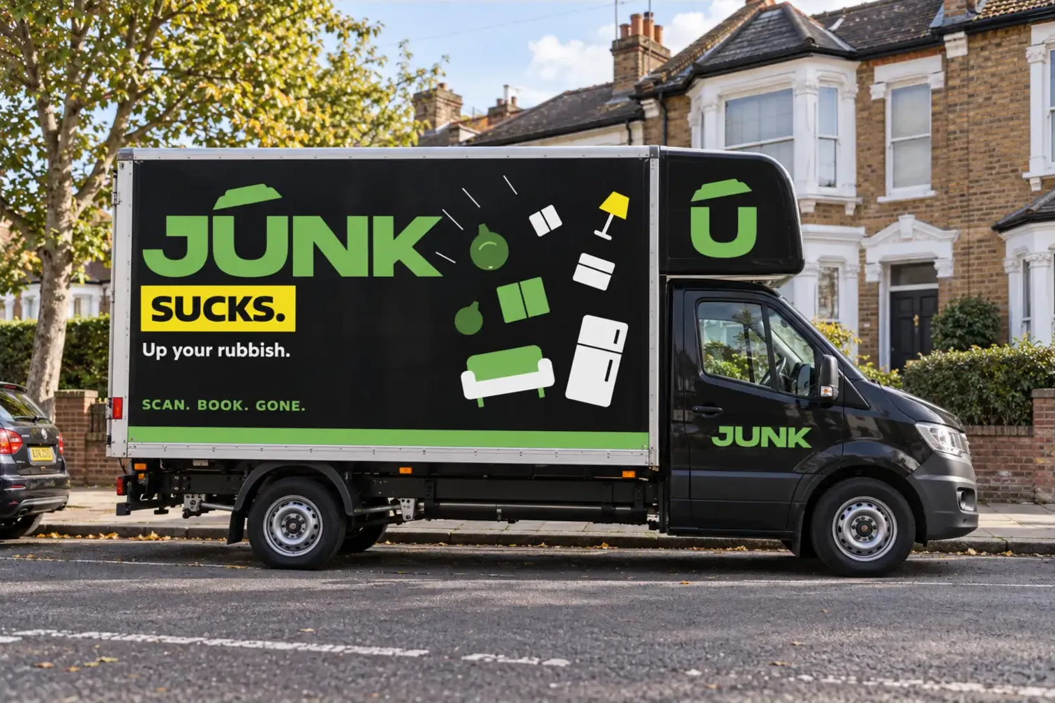
Brand identity, flyer design, vehicle livery and collection-app design for a subscription rubbish collection service.