
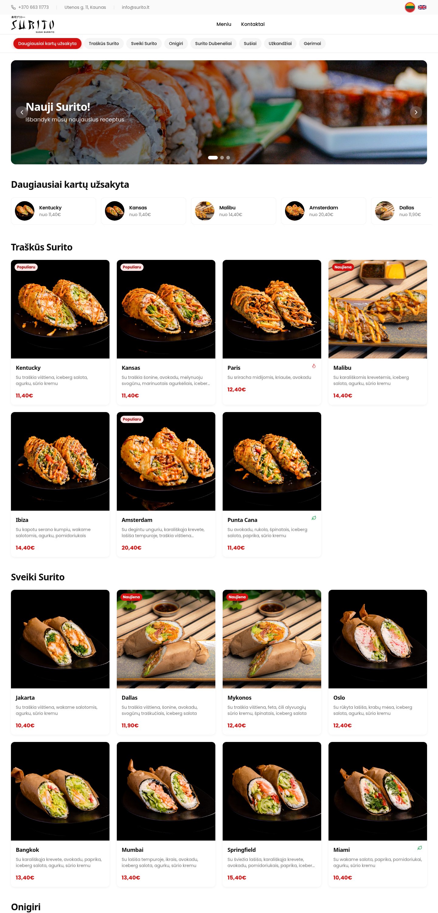
A food-led menu experience for a Kaunas sushi-burrito restaurant.
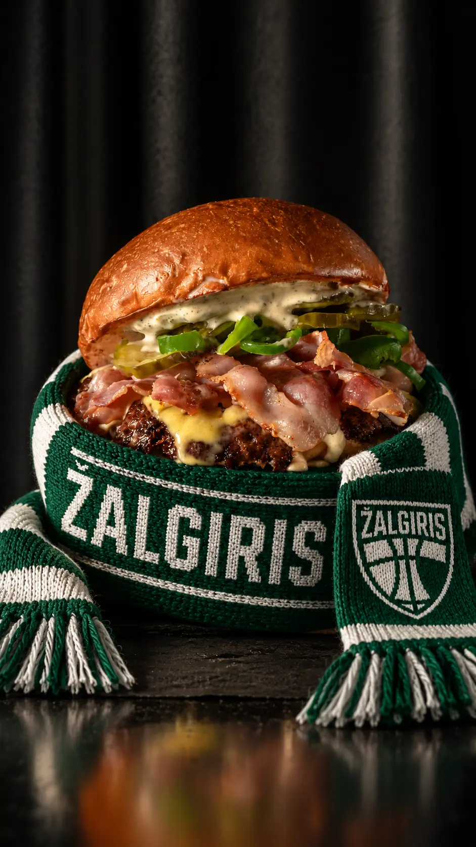
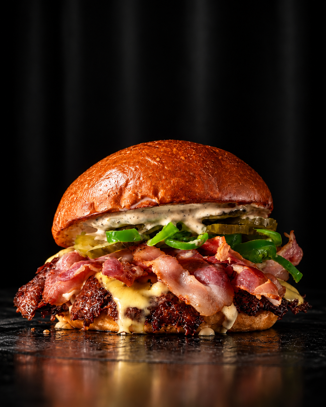
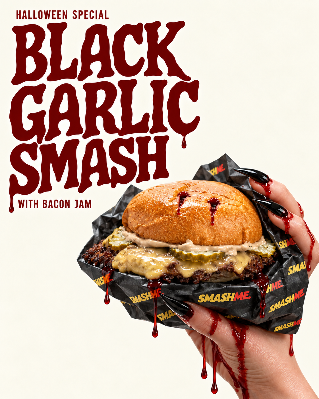
Great food deserves to be seen. For Smashme, we brought the product, the atmosphere and the personality of the restaurant into a cohesive collection of food photographs, short-form video and promotional graphics.
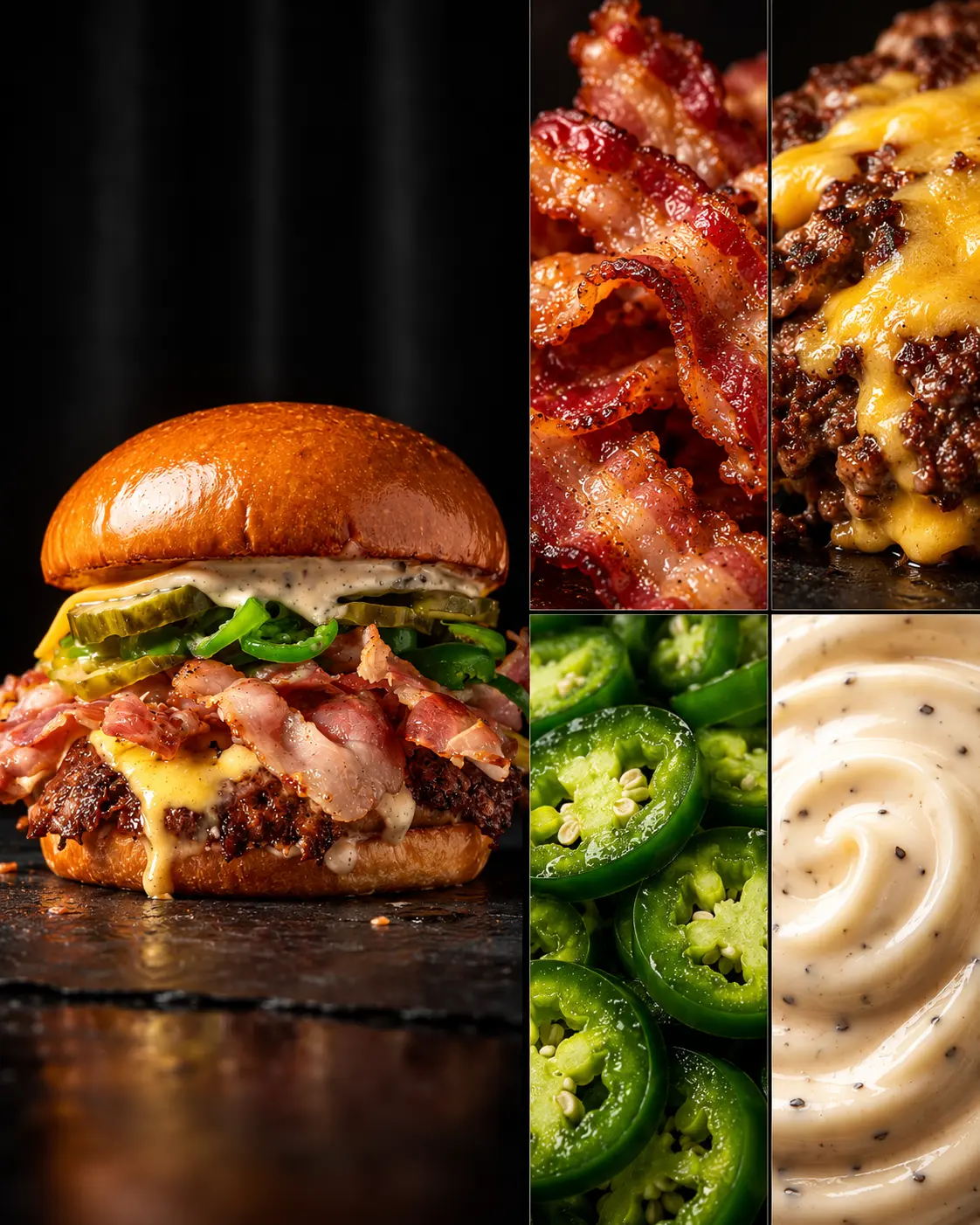
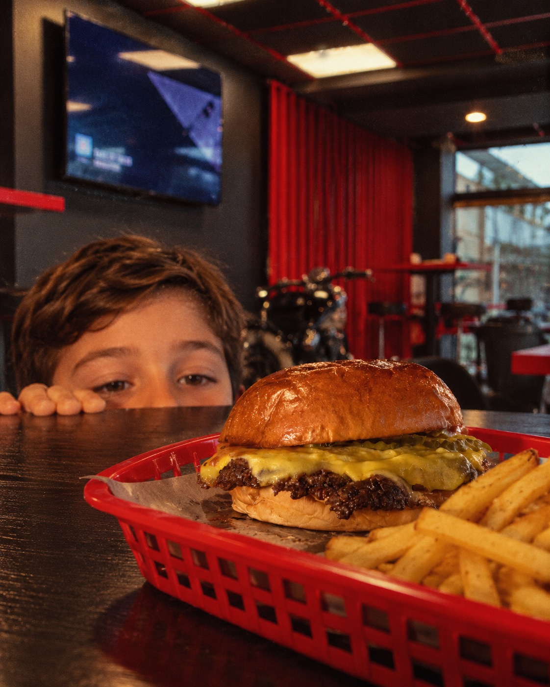
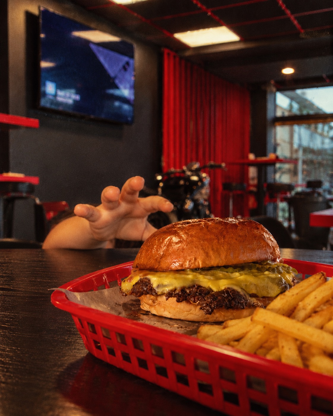
Close-up food photography puts texture, fresh ingredients and the finished burger centre stage. The supplied work also captures the restaurant experience, a Žalgiris-themed creative and a Halloween Black Garlic Smash promotion. Each piece gives Smashme something distinctive to share rather than relying on generic restaurant content.
We help new restaurants reach a wider audience through carefully targeted advertising campaigns, compelling photography, reels and consistent graphics. We bring the creative and the strategy together: content that makes people stop scrolling, messaging that gives them a reason to visit, and a clear next step to explore your menu or make a booking.
Our Business Development Manager, Gedeonas, has spent over ten years building his own restaurants in Lithuania. That first-hand experience brings a practical understanding of launches, customer expectations and the day-to-day demands of hospitality. He can help you position your restaurant with a clear identity and a marketing approach grounded in how restaurants actually operate.
From photography and social campaigns to brand identity and website design, Scrol connects the touchpoints that shape a guest’s first impression. Whether you are opening your doors for the first time or introducing a new menu, we can help make your restaurant easier to discover, remember and choose.
Restaurant website design
Bring your menu, atmosphere and customer journey together. From exploring dishes to requesting a table, we design restaurant websites around what your guests need next.
A food-led menu experience for a Kaunas sushi-burrito restaurant.
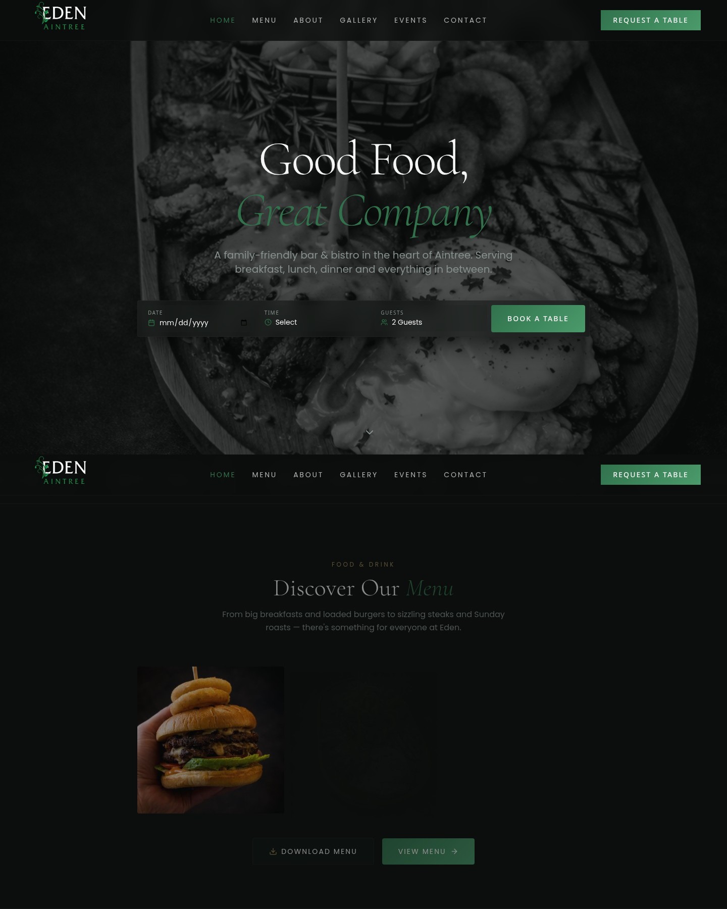
A bar and bistro website with a date, time and guest-count table request.
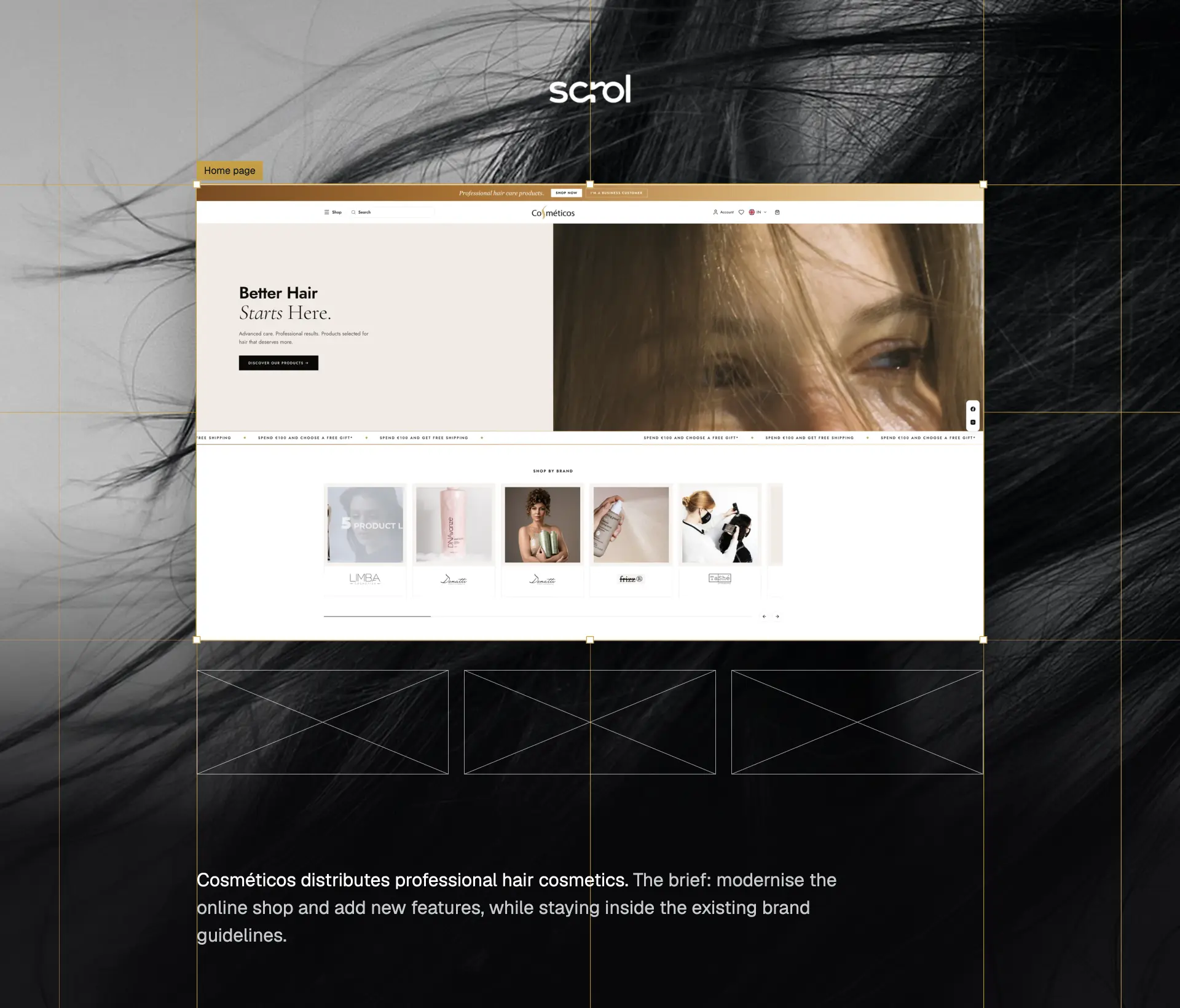
A modern hair-care shopping experience, with a dedicated trade system for business customers.
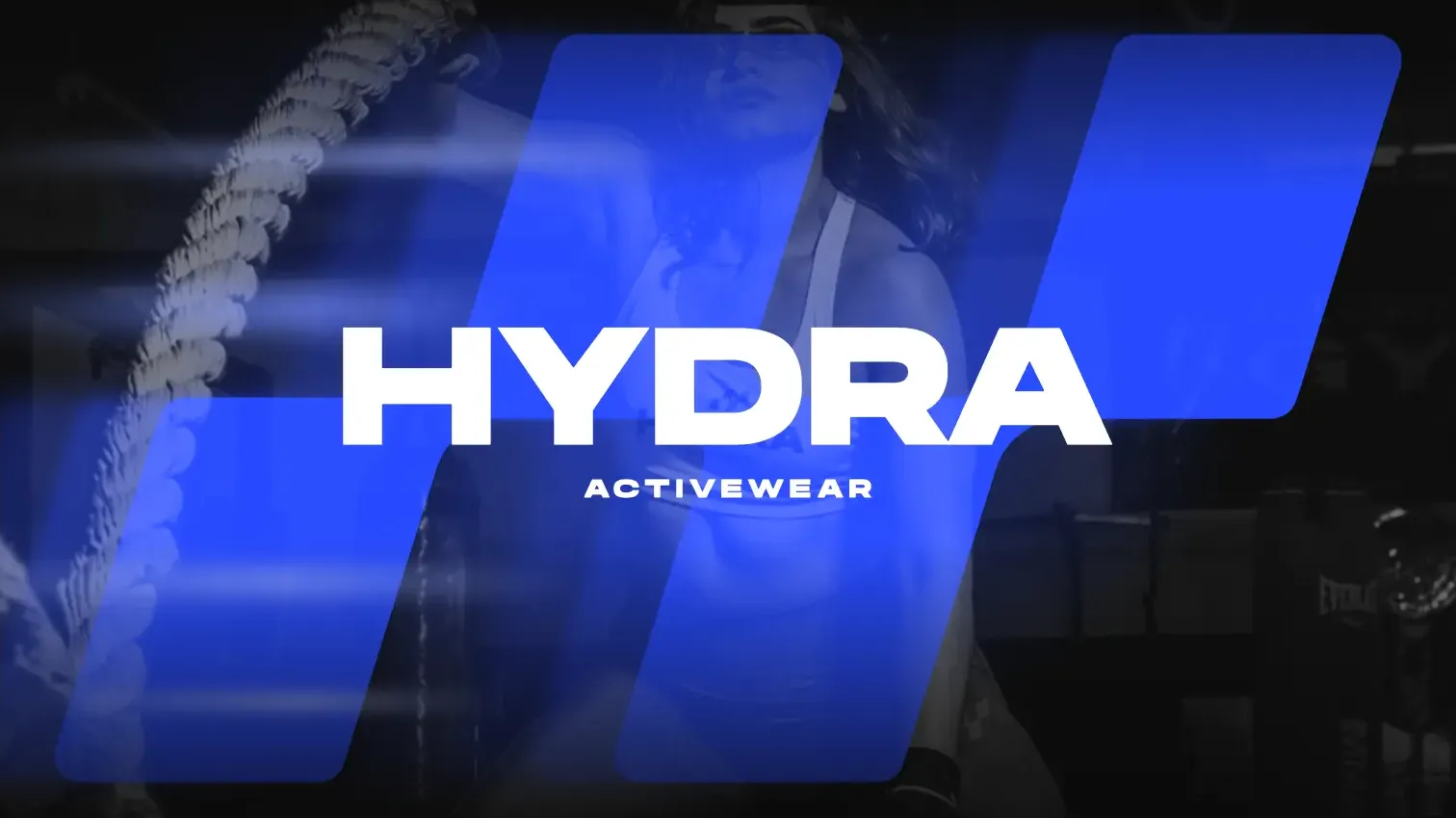
An activewear identity built around a distinctive H mark, bold typography and Hydro Blue.
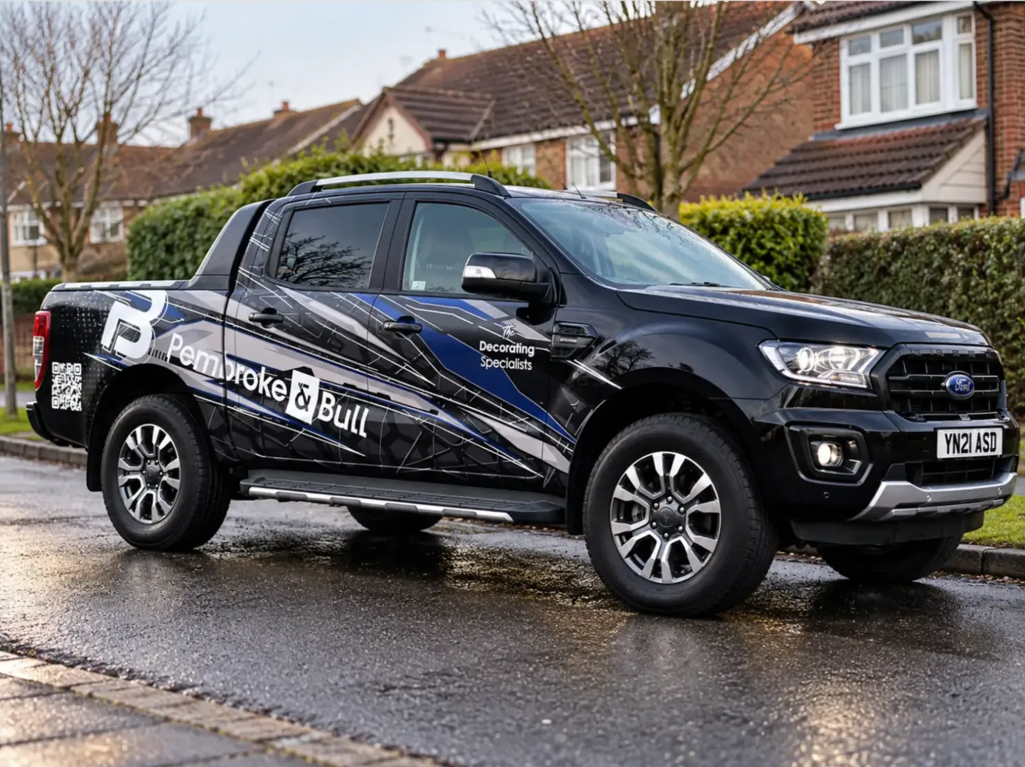
An identity system carried across fleet livery, print, social and site photography.